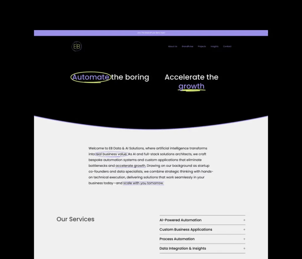
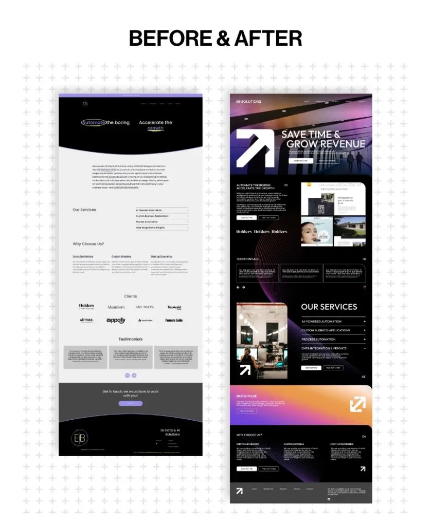
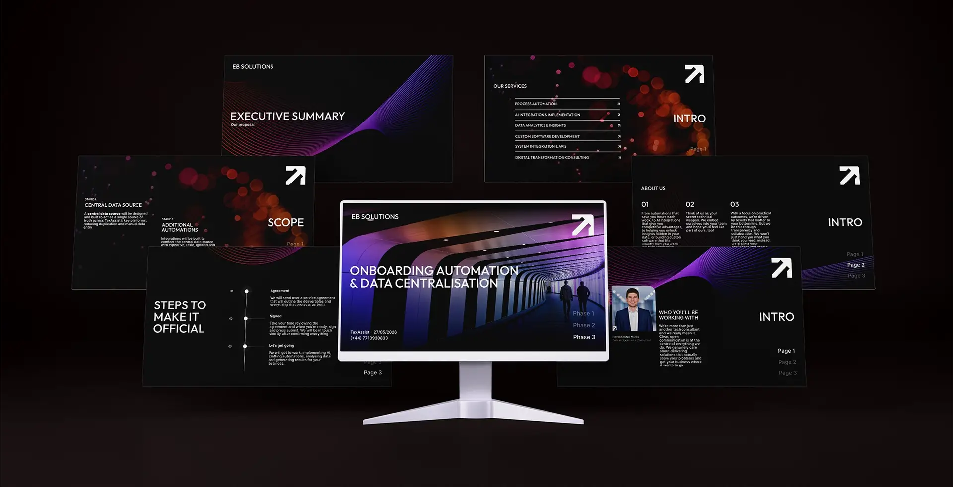
I specialise in design for marketing performance, helping agencies produce creative that converts and scales. I work across motion design, branding and web, creating cohesive design systems that support clarity, usability, and results.
Brand identity design · Logo design · Website redesign · Brand architecture
A full rebrand and website redesign for EB Data & AI Solutions, taking an AI-generated identity and turning it into a warm, credible brand built to win trust and grow revenue.
The brief was clear: elevate the brand and website to increase perceived value, positioning the business to confidently pursue larger, higher-value clients while presenting as an established organisation. At the same time, it was essential to retain the approachable, human personality that sets the company apart in a sector that can often feel complex and intimidating.

We opened with three moodboard routes and landed on the warmer, more human direction — turning the “data and AI feels scary” problem into a brand advantage. From there we tightened the naming, shortening the primary lockup to EB Solutions with Data & AI as a descriptor, while keeping the existing domain to protect its SEO equity. We designed EB Solutions and Brand Pulse as two aligned brands, then presented two full design routes in real landing-page mockups rather than in isolation — making the final direction an easy, confident call that combined the best of both.
A brand that inspires confidence. A refined visual identity that elevates the perceived value of the business, positioning it to attract larger, higher-value clients while remaining approachable and easy to engage with.
Making AI feel more accessible A warmer, more inviting brand that removes the complexity often associated with AI and data, helping potential clients feel confident, comfortable, and ready to start the conversation.
One business. Two clear offerings. A structured brand architecture that clearly separates the service and product brands while maintaining a consistent identity, making it easier for customers to understand, navigate, and trust the business.
Designed to Generate More Enquiries. A strategically restructured website built around user journeys, with stronger messaging and carefully placed calls to action that encourage more visitors to take the next step.
A brand system that scales. A flexible identity toolkit designed for future growth, with all core brand touchpoints, including the website, presentation deck and digital assets, working together to create a consistent and professional experience.
The finished identity looks established, feels approachable, and is built to convert.
a refined EB monogram with a clear EB Solutions / Data & AI lockup, plus short and stacked variants for every placement.
a considered palette (evolving the original colours), typography and a consistent visual language across web, documents and social.
aligned identities for EB Solutions and Brand Pulse.
branded proposals, letterheads and templates for every client touchpoint.
a homepage re-sectioned around one goal, anchored by a hero built to land the core promise: save time and grow revenue.
We also created a bespoke animated GIF for the client’s Google Workspace profile icon — the avatar on every email, doc and calendar invite. It’s a tiny surface with outsized reach: a subtle animation turns a static touchpoint into a moment of delight, reinforcing brand recognition every time it lands in an inbox.
© All Rights Reserved