I specialise in design for marketing performance, helping agencies produce creative that converts and scales. I work across motion design, branding and web, creating cohesive design systems that support clarity, usability, and results.
Brand identity · Logo design · Brand guidelines · Website design
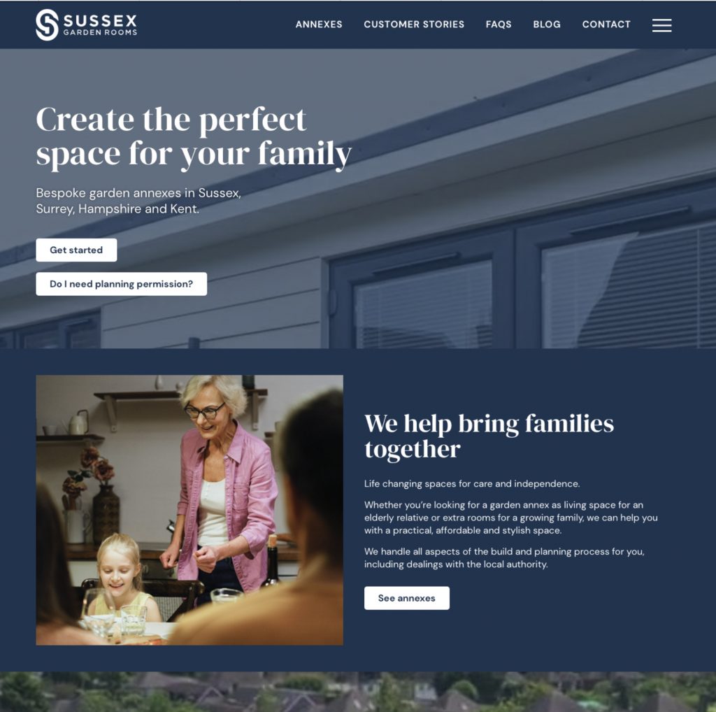
A rebrand for Sussex Garden Rooms, a friendly local company designing and building bespoke garden rooms and annexes across the South East. They already had a brand the goal was to modernise it and bring green into the identity, connecting it to the gardens their spaces are built for.
The brief was clear: a modern identity that actually represents what they do, while staying warm and approachable for the homeowners they work with. So the design draws on the visual language of architecture clean lines and structure that nod to designing and building the annexes themselves grounded by a natural green that keeps it human rather than corporate.

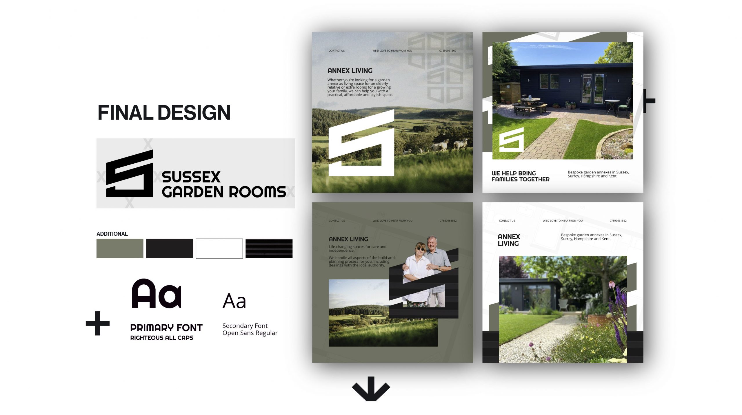
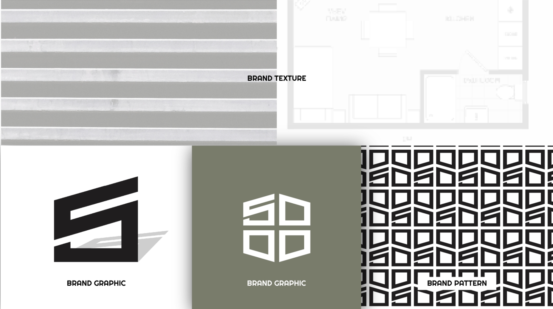
We built the identity around the language of architecture clean lines and structured forms that echo the process of designing and building each annexe, so the brand shows what they do rather than just saying it. Green runs through the palette to tie the company to the gardens their spaces live in, kept warm and approachable rather than corporate. From there we designed the logo and a full visual system of type, colour and pattern. We captured it in a mini brand guide deliberately condensed and simple to use, so a small team can keep the brand consistent without the overhead of a huge manual then brought it all to life in website mockups
A modern logo and mark drawing on architectural lines, with variants for every placement from website header to site signage.
A considered palette led by natural green, with typography and pattern that feel contemporary and unmistakably local.
a concise guide covering logo use, colour, type and tone of voice, so the brand stays consistent everywhere.
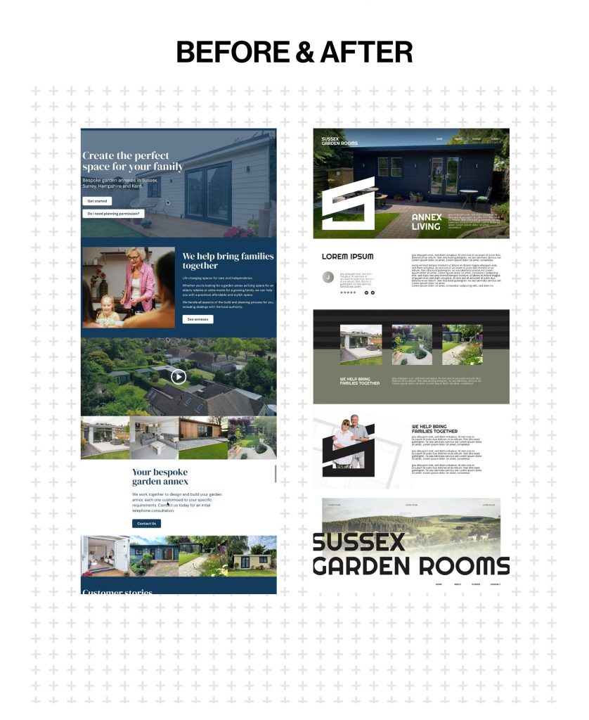
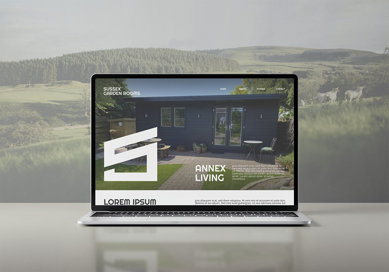
homepage and key-page designs showing the new identity in action, ready for the website update they're planning.
The finished brand looks modern, feels approachable, and is built to win enquiries.
a modern logo and mark drawing on architectural lines, with variants for every placement from website header to site signage.
a considered palette led by natural green, with typography and pattern that feel contemporary and unmistakably local.
a concise guide covering logo use, colour, type and tone of voice, so the brand stays consistent everywhere.
homepage and key-page designs showing the new identity in action, ready for the website update they're planning.
a set of example posts showing the new brand in application, so they can picture exactly how it looks out in the real world.
© All Rights Reserved